Three Piece House
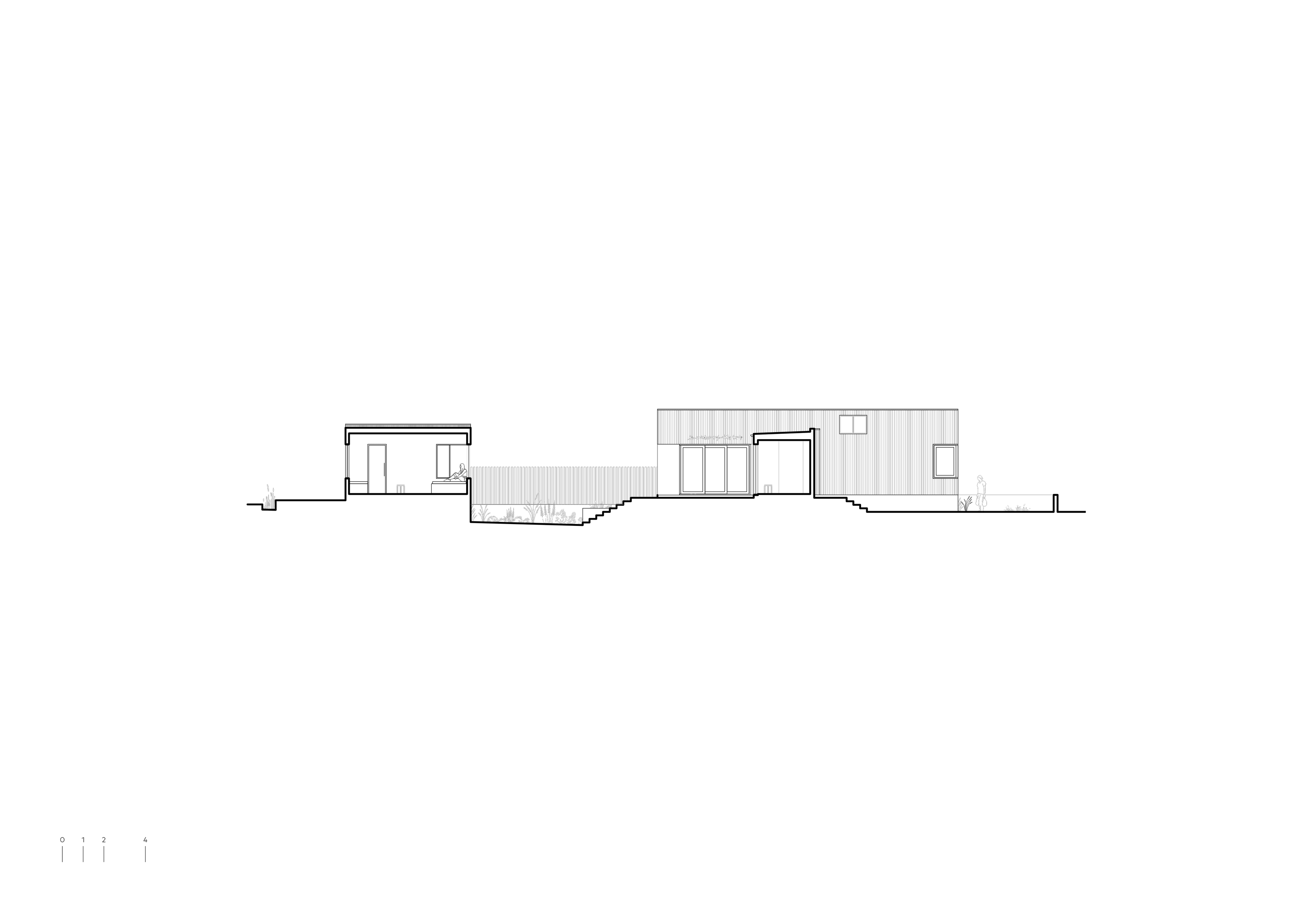
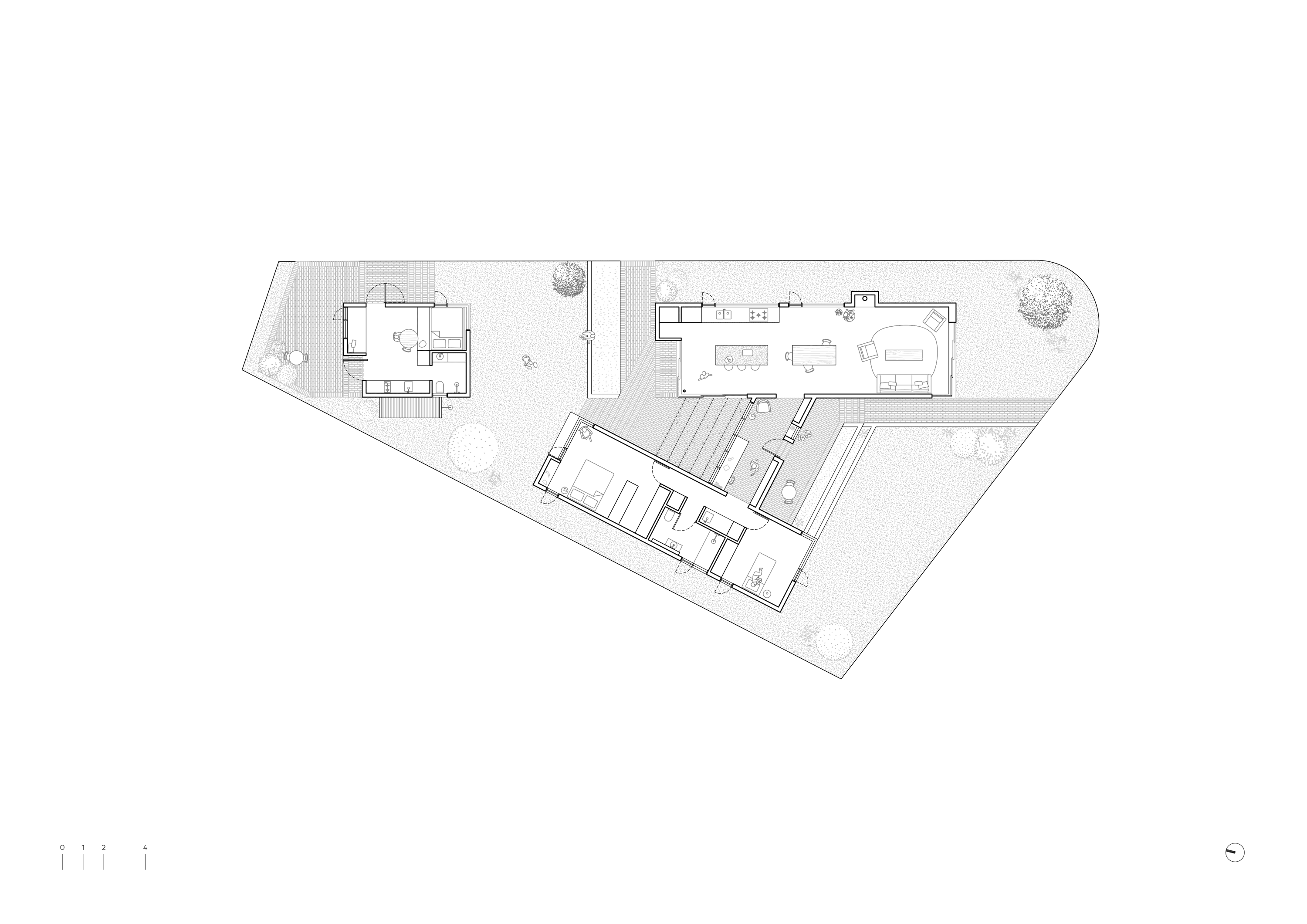
Three Piece House is a courtyard house, designed for a couple looking to downsize and live more simply. The project places a modest, single-storey house and studio on its site. These buildings are skewed to follow the site’s boundaries, and cluster to create privacy on this exposed corner lot.
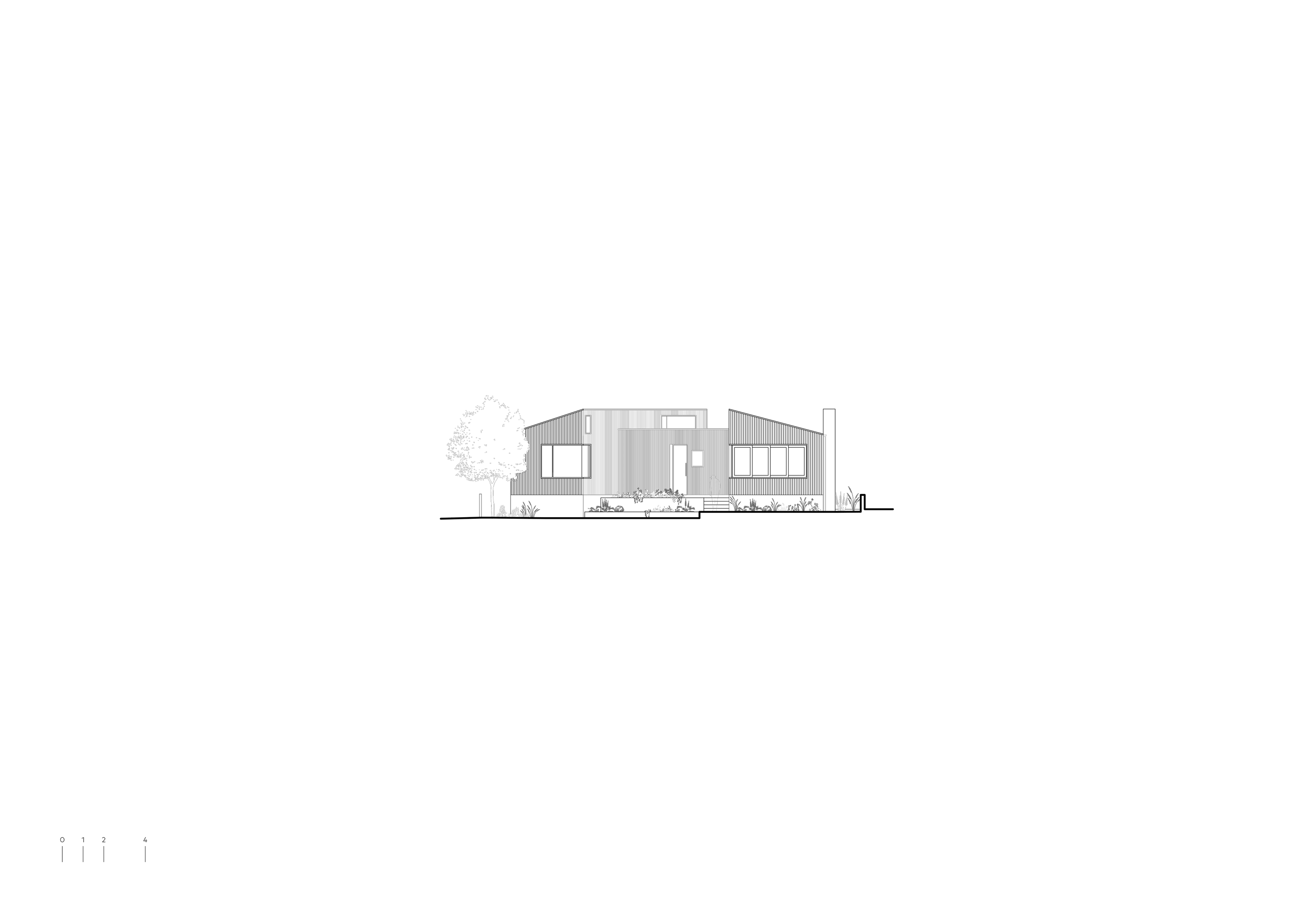
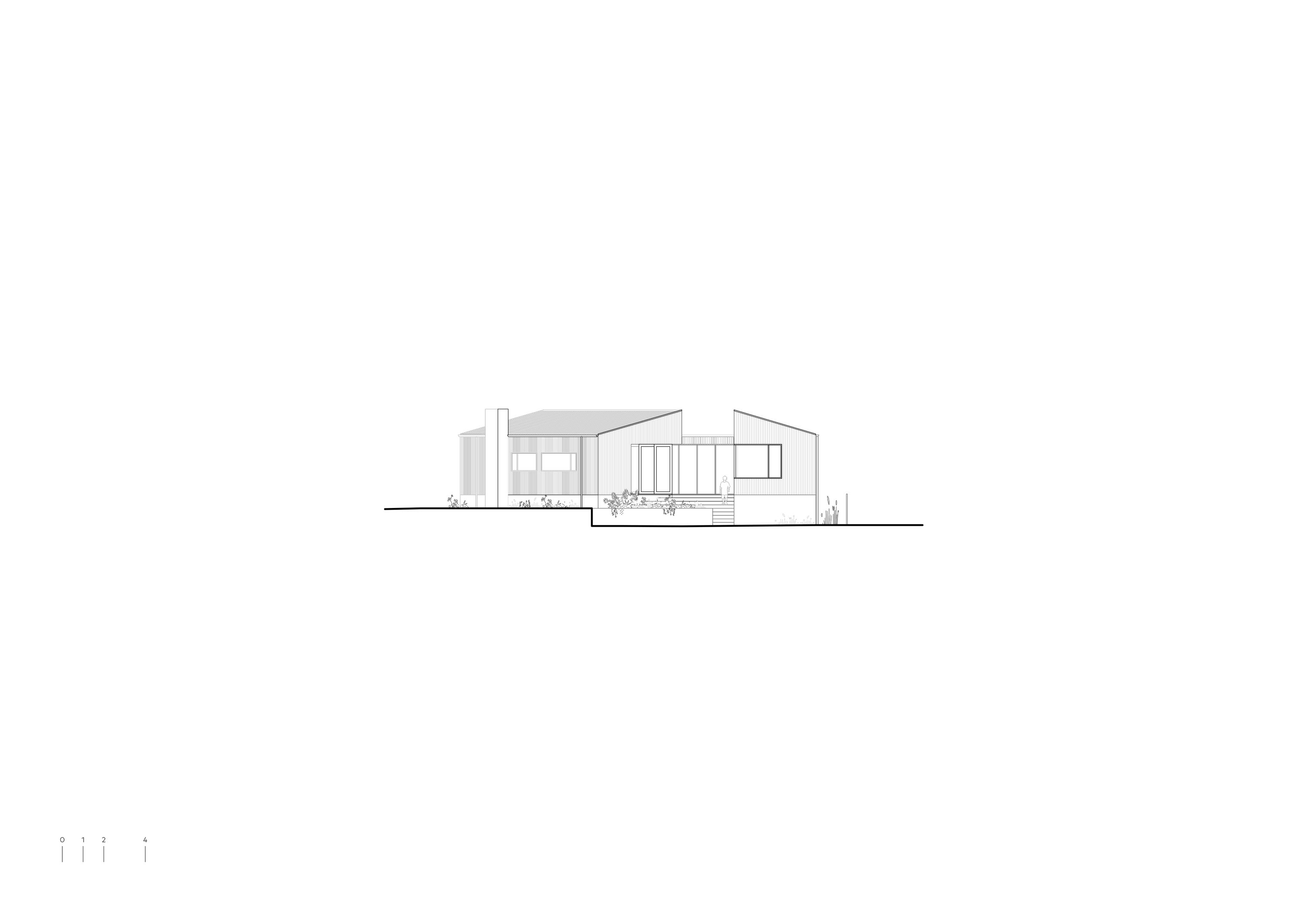
The site was restricted by flood controls, which required the building to be raised above a flood plain. In contrast to a conventional architectural response—which might elevate the house on stilts—Three Piece House sits on a solid brick base. This design approach was inspired by Jørn Utzon’s text, ‘Platforms and Plateaus,’ and the gesture lends the house heft and presence.
The main house is composed of two pavilions—one for living, and one for sleeping. A reading corridor, which bridges between, faces out to the garden and, in winter, is bathed in northern sun. In response to the client’s brief—and a budget that sought value—the rooms all maintain a compact proportion that is balanced by generous ceilings and carefully cropped openings, which lead the eye outwards and to the surrounds.

Type
New Home
Location
Newcastle, NSW
Country
Worimi
Client
A downsizing couple
Status
Complete
Completion
2018
Builder
GTS Constructions
Engineer
Northrop
Interior Design
TRIAS
Landscape Design
Sustainable Surrounds
Photographer
Benjamin Hosking

- 1. The material palette builds upon the reclaimed red brick.
- 2. An early diagrammatic sketch of the project.
 1
1 2
2At Three Piece House, courtyards and gardens ramble between the buildings. The two main courtyards have distinctive characters: one is extroverted and public, the other introverted and private. The southern porch, which faces the river, is a space for neighbourly chats and watching street life go by. The northern courtyard, meanwhile, is a sheltered space for retreat and gathering with family and friends.
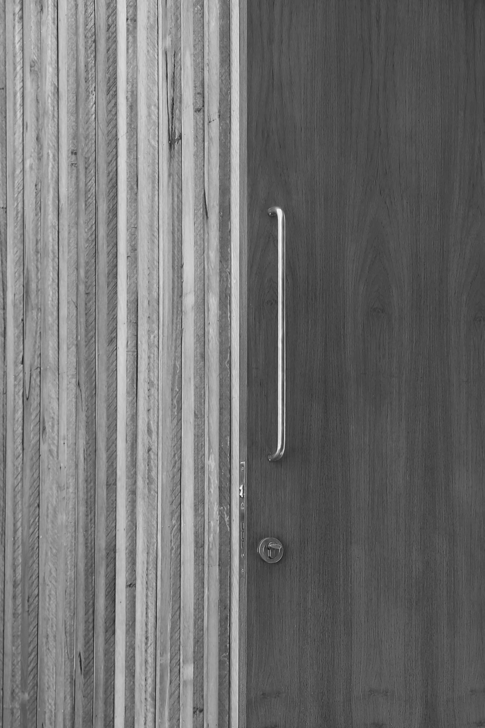
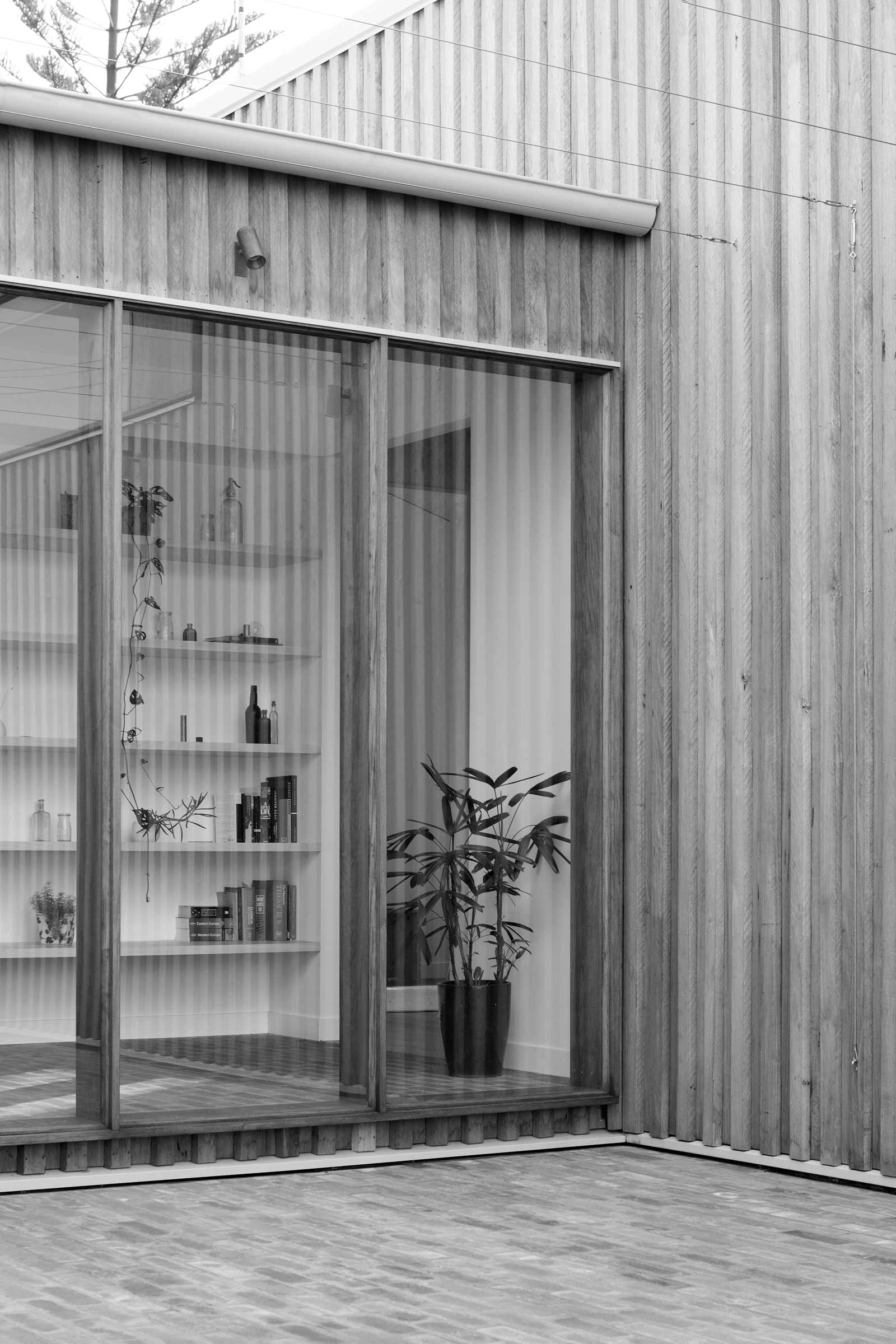
The materials at Three Piece House are robust and resilient, as befits a windswept, coastal site. The textures are raw and rugged, and have been chosen to become more beautiful as they age.
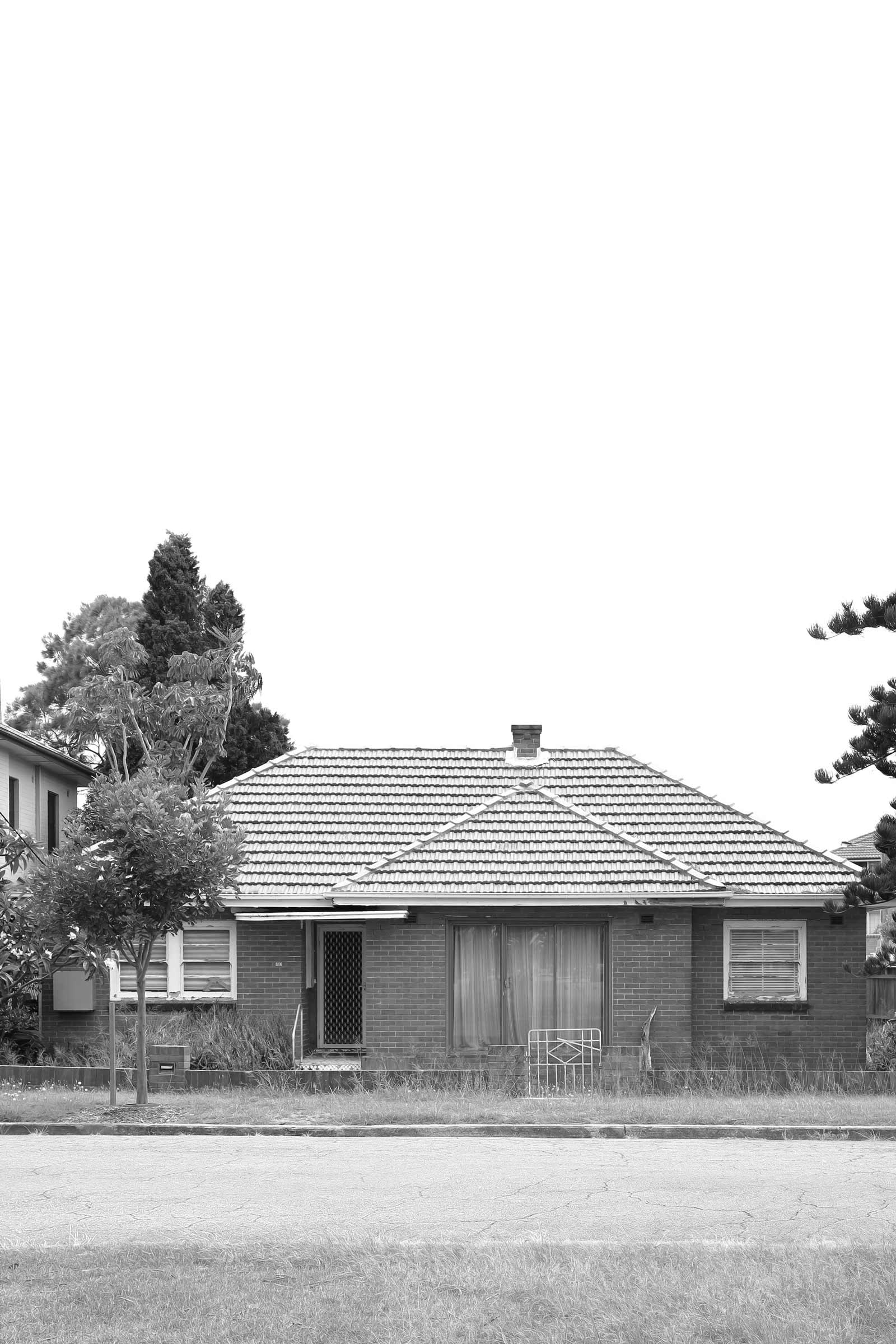
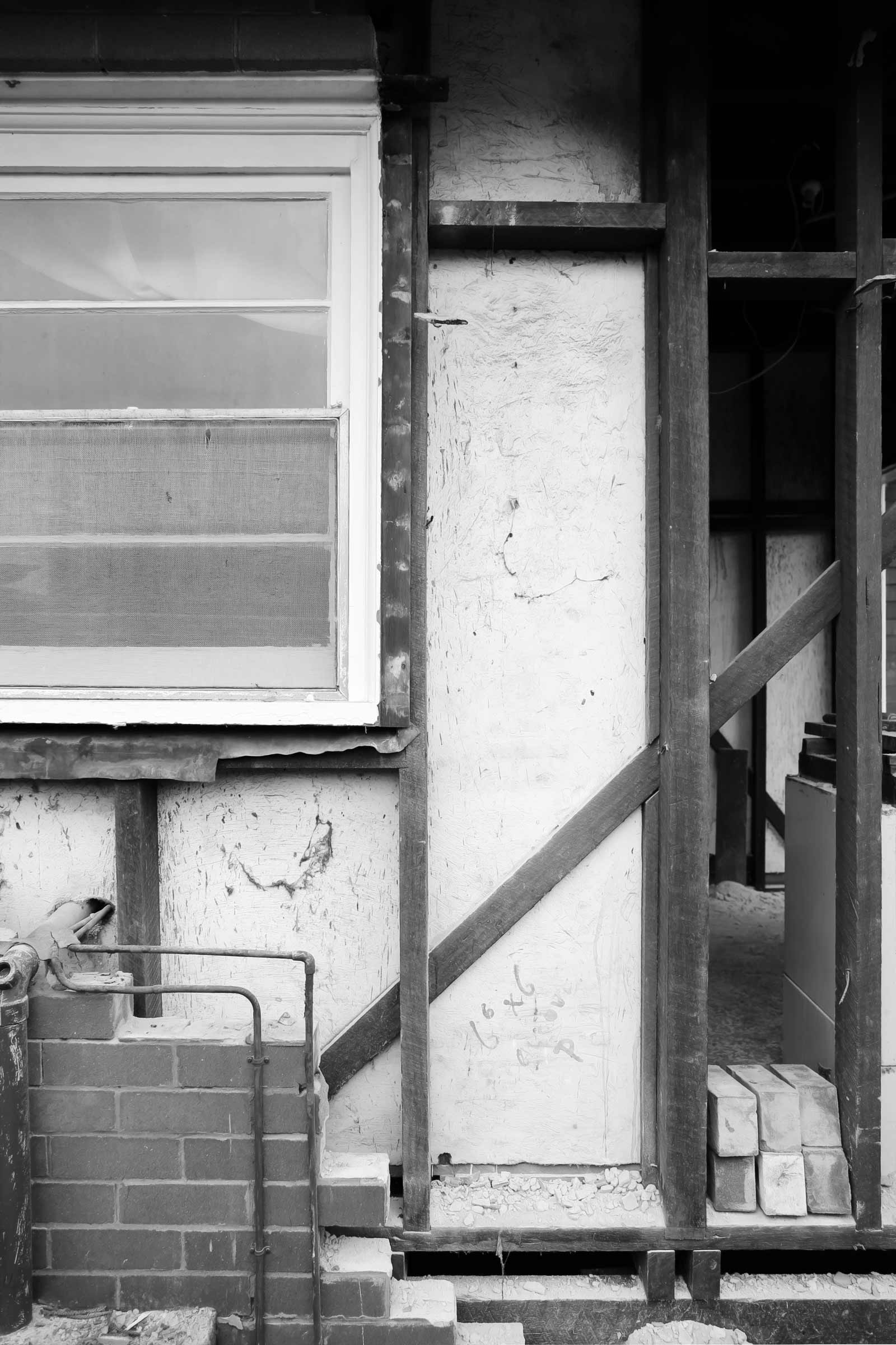
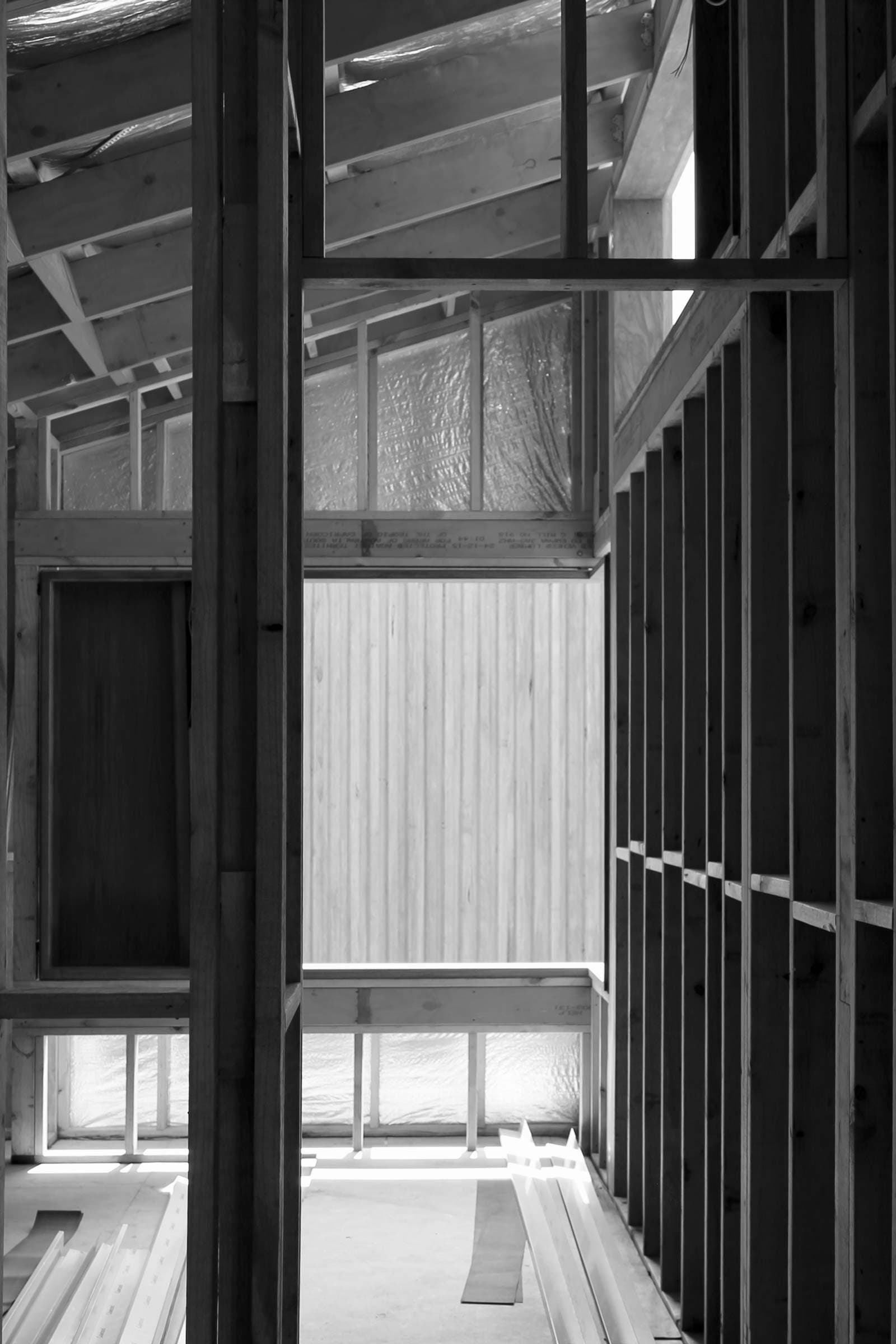
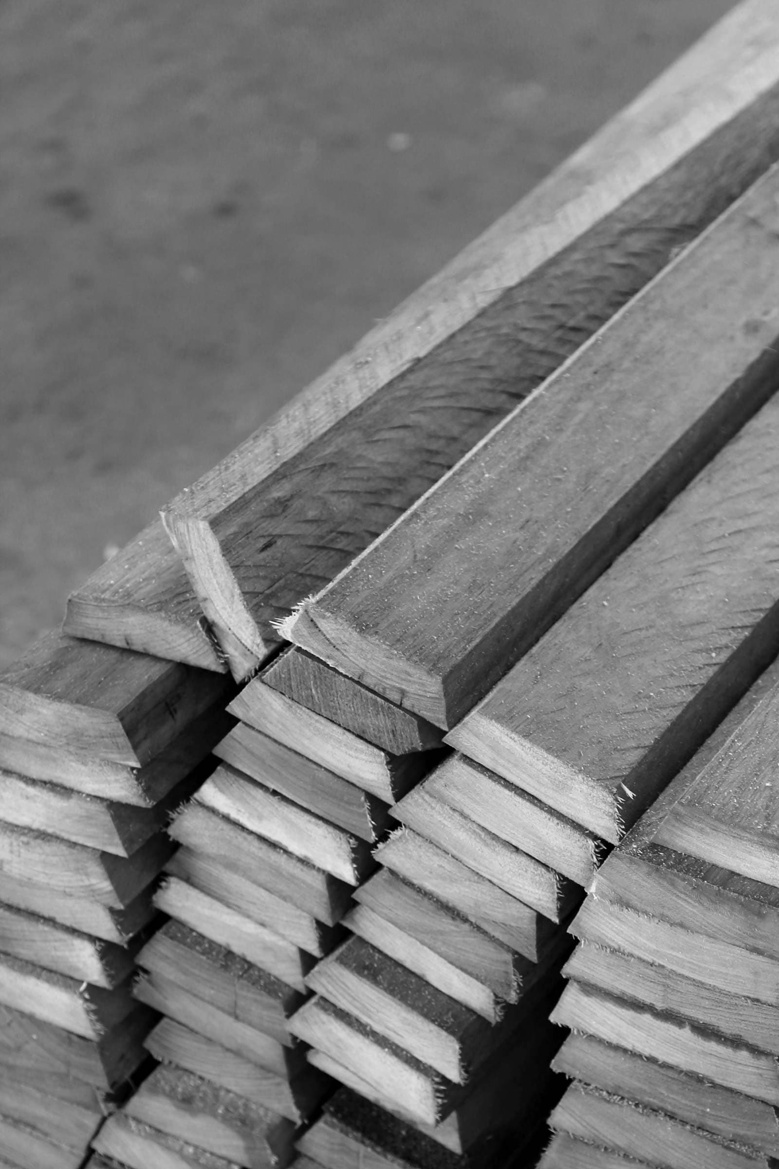
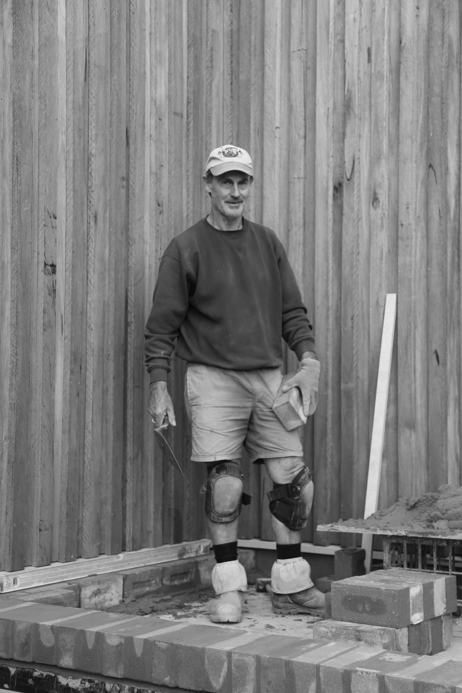
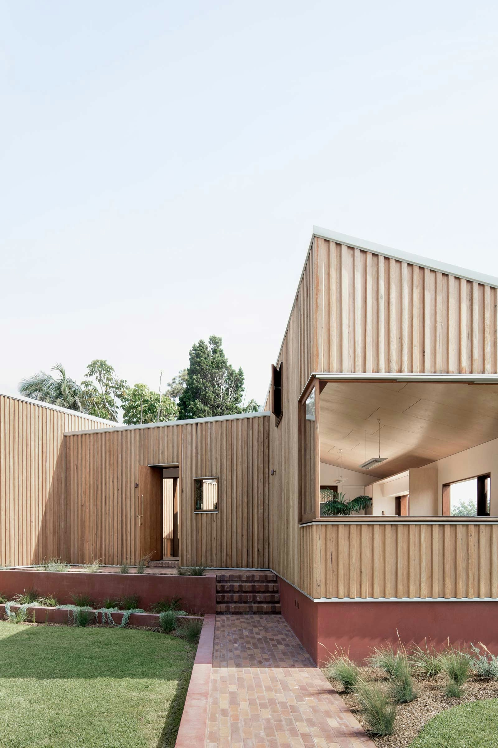
The skillion forms are clad in radially-sawn Silvertop Ash, a highly resource-conscious product. The solid masonry base is rendered in earthen-red tones, colour-matched to the recycled brick paving and the rusted reds of passing ships. The bricks used across the project were reclaimed from the existing house—an unremarkable 1940’s bungalow—to form the platform upon which the new home sits. This gesture is both inherently sustainable, and an act of storytelling: the new home rests upon the bones of the building before it.

- 1. The house sits proudly on a reclaimed red brick base.
- 2. A low garden gently curves around the corner of the site.
 1
1 2
2- 1. The reading corridor is lined in recycled brickwork.
- 2. The living room window peels back to frame the Hunter River.
 1
1 2
2- 1. A brick island bench emerges from the floor.
- 2. Terracotta tiles adorn the bathroom bench.
 1
1 2
2
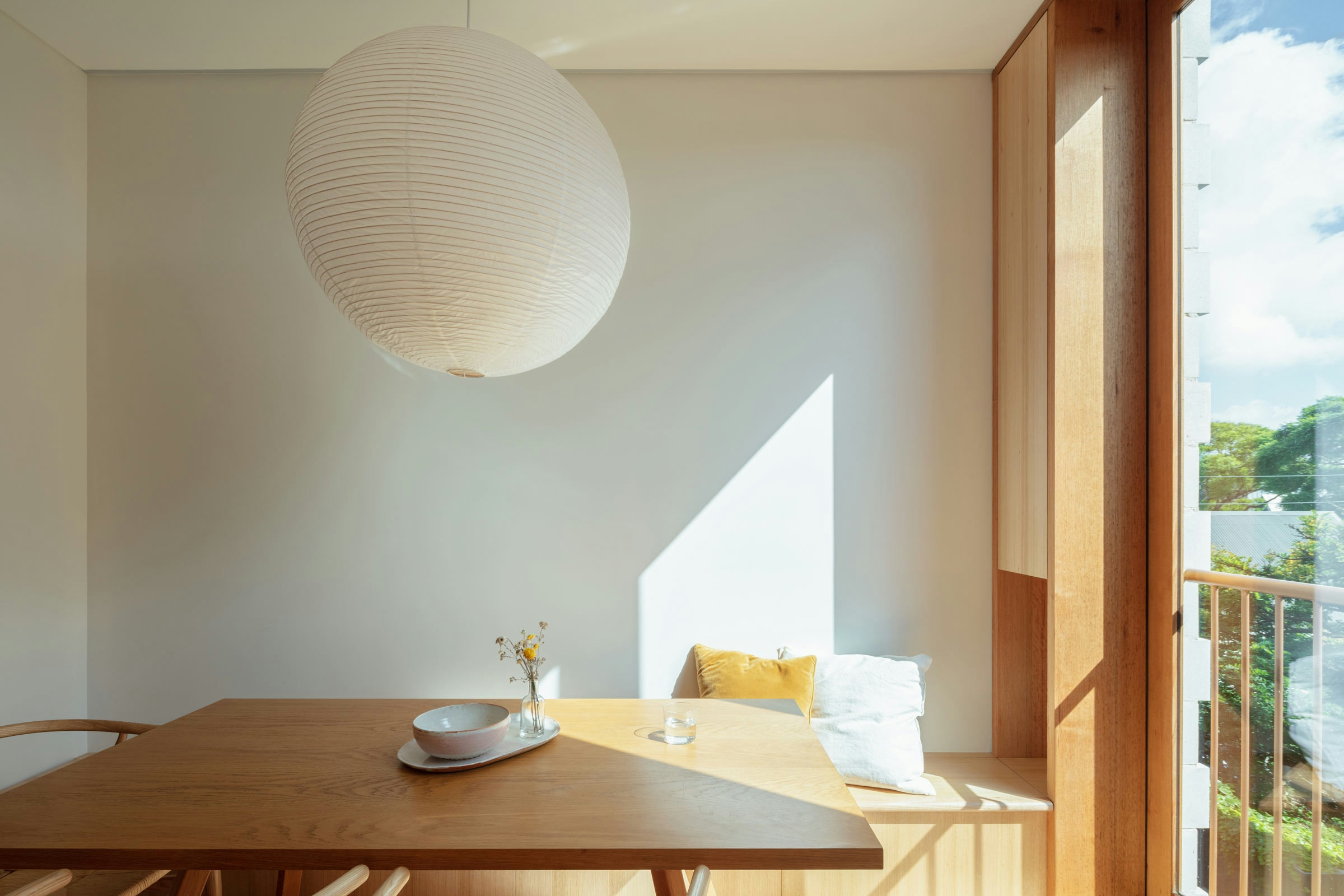
Throughout the interior, a palette of timber floors, crisp white walls and plywood ceilings provides a warm and welcoming envelope. Corner openings peel back to reveal greenery and views, while high windows exhale air and offer slivers of sun and sky.
Across this project, the budget is spent thoughtfully, focusing on details that improve the clients’ daily life: a series of pendant lights suspended in corners, touches of brass for tactility, and a tiled bench in the bathroom for washing in old age. Every decision is a careful negotiation of longevity and value. The project is also an excellent example of the unique solutions that can be pursued using the complying development process, which otherwise encourages stock-standard housing.
Three Piece House is a dynamic and distinctive piece of architecture, which has brought beauty and dignity to a suburb not known for its architectural merit. It is a testament to small living in suburbia.

- 1. Corner windows frame pockets of nearby greenery.
- 2. Simple built-ins add storage and utility to compact spaces.
 1
1 2
29 images
